
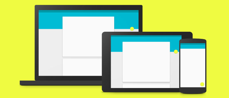

One of the most exciting changes in Android 5.0 is the introduction of what Google calls “Material Design,” a new design language that determines how the company’s apps will look going forward. If you follow Android blogs or tech sites, you may have seen these two words thrown around quite a bit. But what do they actually mean?
Let’s break this down.
Think About Material Design Literally
The bulk of what you need to know is explained right in the name – Material Design. Google’s new interface is designed to look like it’s made from materials you can actually touch. Through the use of shadows and animations, things onscreen should move around the way you would kind of expect them to in reality. When you tap a button, additional actions pop out from under it. When you slide from the left, menus scoot on top of the previous screen. When you close an app, it slides away into the bottom of the screen. In a way, it’s kind of like interacting with a deck of cards.
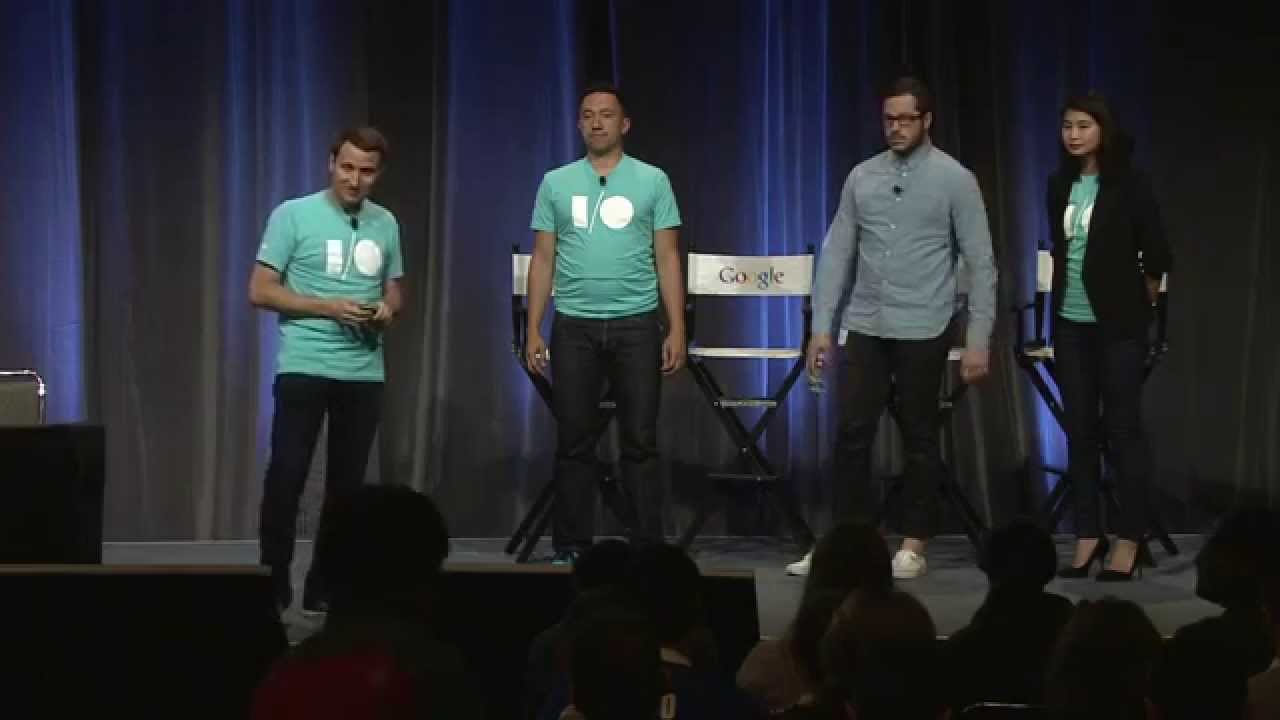
Here’s how Google developers explained things at Google I/O 2014.
But What Does Material Design Actually Look Like?
Material Design borrows from concepts already applied to print design (think magazines and newspapers). Shadows help create a sense of depth where there is none, and proper usage can imitate the look of papers stacked several layers high.
Using these same techniques, modern apps look as though they have a sense of depth. The sidebar still comes out from the left side of the screen as before, but now it should float over the action bar at the top of the screen. Many apps have a Floating Action Button that hovers on top of other elements, and tapping it can bring out more options from underneath
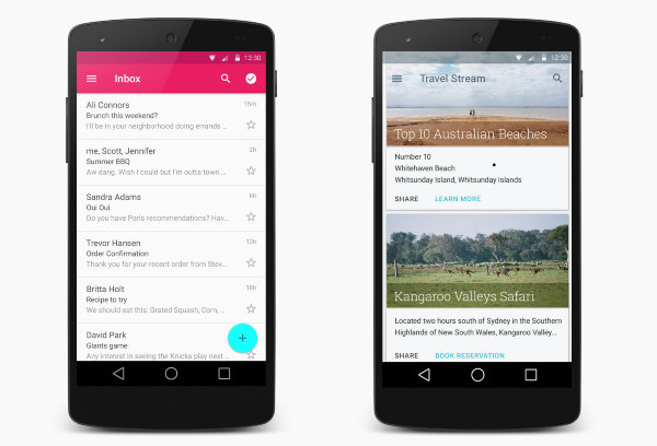
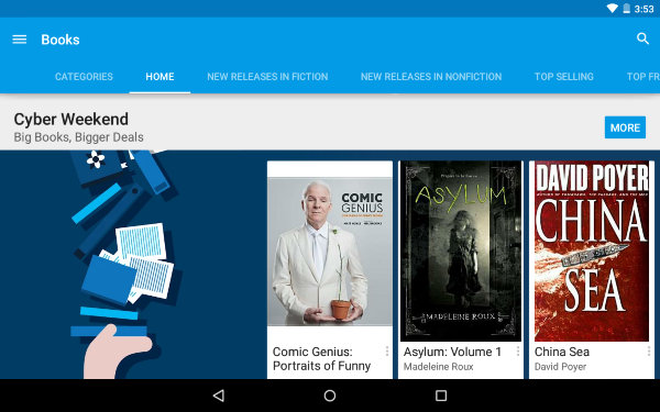
One trademark of Material Design apps thus far has been bold, bright colors. Google has exemplified this in its own apps, with Gmail being red, Inbox by Gmail sporting a light blue, and Keep getting yellow. Play Music is orange, Play Books is blue, Play Newstand is purple, Play Games is green, and Play Videos is red. The Play Store app swaps between these five colors, but that alone isn’t what makes it a good example of Material Design.

Your app can be gray and drab, like the current version of Google Drive, and still adhere to design guidelines. But colors do help establish a sense of which app you’re in and what function you’re doing. So while bold, attention-grabbing colors aren’t an inherent part of Material Design, they’re still a good thing to see.
Animations Are Key
It’s a little challenging to convey Material Design in static screenshots, and animations are a large reason why. To really make everything feel like actual material, each piece of the user interface has its place. Apps slide into the screen from the bottom and return there when done.
In the Android 5.0 version of the Google Now Launcher, the app drawer icon morphs into the white tray that holds your apps. Sidebars, buttons, and information cards all slide out from somewhere.
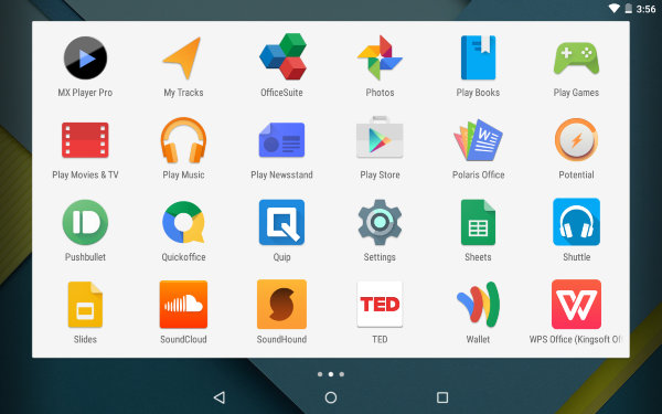
These animations don’t just look attractive, they help users understand what’s happening. Having one page of an app slide out into another conveys that you’re looking at a different set of information now, whereas having the screen flicker and change instantly could appear to be the result of a glitch.
Animations show how different aspects of the user interface respond to our touch, and this is increasingly important as we move away from devices with physical input methods. We need to know what’s going on as we tap on different parts of the screen.

Material Design Isn’t Just About Android
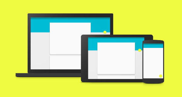
While Google’s new design language is stirring the most excitement on its mobile platform, that doesn’t reflect its origins. This effort spawned from challenges encountered creating websites that scale across different screen sizes. The search giant wants the look and feel to transition across form factors, with people able to navigate one device using the information they learned from another. You can already see Material Design in the web versions of Keep, Drive, and Inbox by Gmail. It’s expected to show up more prominently in Chrome OS as well.
Where Can I Find Material Design On Android Today?
Nexus devices shipping with Android 5.0 already provide a thoroughly Material experience. The latest version of the OS has also started to roll out to Nexus and Motorola phones and tablets. People without Android 5.0 don’t have to do without. Many of Google’s apps have already made the transition, and they’re available right in the Play Store. You can also check out our list of eight other apps that already show off Material Design.
And if you’re an Android app developer, Google has released a Material Design checklist that can help you be sure you’re getting everything right. Google has also provided a website that lays things out plainly for average folks too.
If you have questions about Material Design, don’t hesitate to ask away in the comments below!
Image credits: Android Developers, Google