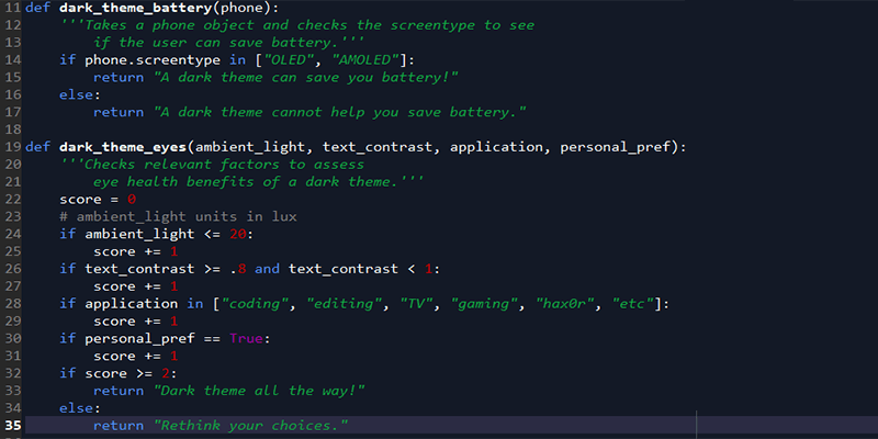
The dark side isn’t just popular with megalomaniacal Jedi knights – it also has quite a following among everyday Internet users. Some people just like the vibe, while others use dark themes, specifically because they’re supposed to reduce eye strain and save battery.
It makes intuitive sense: brighter lights seem to be a little rougher on the eyes, and white is a higher-energy color, so it probably uses more battery, right? As usual, though, reality is a little more complicated. While it’s true that darker colors use less energy to generate, not every type of screen is set up to take advantage of this. And as far as your vision goes, how much your experience will improve with a dark theme depends heavily on your eyes and the ambient light situation where your screen is.
Also read: How to Add Dark Mode to Google Chrome
Do dark themes save energy?

This is relatively straightforward: does your device use an OLED or AMOLED screen? If it does, then dark themes can save you power! If your device instead uses an LCD or another type of screen, changing the color won’t do much for your battery life.
AMOLED screens work by passing electric currents through organic compounds to light up individual pixels. If a pixel is black, though, it’ll just stay turned off, not drawing any power to illuminate. True black (hex 000000) is the only color that will turn off the pixel, though. Any other color will draw more power, with white being the most expensive to display in terms of electricity consumption.
AMOLED is usually more power-efficient than LCD, but not when it comes to white backgrounds. Even Google, whose Pixel phones use an AMOLED, has started promoting dark themes as a way to save battery on Android devices. They’ve demonstrated up to 63% reduced battery usage by dark themes on AMOLED displays, and they’ve been adding this functionality into newer versions of Android.

On the flip side, though, devices with any form of LCD screen won’t see battery life impacted by color at all. Brightness, yes; color, no. LCD displays have a bunch of layers that contribute to the end image, but part of the equation is a backlight made up of a bunch of LEDs. If your screen is on, every single one of those LEDs turns on, consuming the same amount of power regardless of the color that each individual pixel is flipped to. The pixels themselves aren’t consuming any power in an LCD screen.
The science is pretty clear here, which is nice. AMOLED/OLED benefits a lot from dark themes, while LCD does not.
Also read: How to Turn on Dark Mode for Your Most Used Apps in Windows
Do dark themes help your eyes?

This is where things get a little trickier: because dark themes are better for your eyes sometimes, but not all the time.
In terms of readability, the verdict is clear: black text on a white background is the best. This comes down to the properties of color, light, and the human iris. White essentially reflects every wavelength in the color spectrum, which means our irises don’t need to open wide to absorb enough light, leaving them in their natural shape. Because the lens isn’t being deformed by a wider iris, we can see things more sharply, especially a high-contrast color like black, which actually absorbs wavelengths instead of reflecting them.

White text on black backgrounds doesn’t work as well, since our iris needs to open up more to get light, deforming the lens and making it look like the white letters are bleeding into their black backgrounds (known as the “halation” effect). This is especially true for the 50% of the population that has astigmatism.
All this actually does have an effect: scientific studies have found repeated evidence that text readability is significantly improved by dark-on-light vs. light-on-dark.
That’s great for readability, but what about eye strain? Starting at a white screen for a long time certainly feels worse, but the scientific jury is still out, and the colors may not really be the problem. Here’s what we do know.

Pros:
- Dark themes can reduce eye strain in low-light conditions (night-time or dimmer workspaces).
- High contrast between text and background reduces eye strain.
- Applications that require syntax highlighting (like programming) can be easier to see with light-on-dark themes.

Cons:
- Dark themes can put more strain on your eyes in high-light conditions, since it washes out the text.
- 100% contrast (white text on a black background) is typically harder to read and may cause more eye strain.
- Applications that require reading long passages of text will typically be harder to read in a light-on-dark theme.
What does this actually mean? Basically, dark themes are most useful when you’re in low ambient light or don’t need to read large chunks of text. They also need to maintain a relatively high level of contrast for readability, but going with pure white on pure black probably isn’t a good choice. If you do a lot of reading on your screen, you should probably stick to a dark-on-light theme (maybe a light gray background with black text) and try to control your screen brightness and your ambient light situation instead of changing the colors.
I like the dark side! It has cookies!
If you like using dark themes, go for it! Whatever makes your eyes happy or satisfies your aesthetic fancy. They won’t save you any battery unless you have an OLED screen, and they’re a mixed bag when it comes to eye strain, but there’s certainly not much evidence against them, especially if they’re careful to toe the line when it comes to being high-contrast, but not so high-contrast as to get a halation effect going. Take a cue from dark-themed apps like Netflix and Amazon TV, which are mostly used in low light (nighttime) and have interfaces designed accordingly: go for dark themes when it’s dark, light themes when it’s light, or just experiment and see what feels right.
Image credits: Adwaita dark theme, LCD layers, Nexus One Screen Microscope